Indeed Feedback component family

Design system; components
Overview
A top Indeed priority for 2019 was scaling design across our products.
Our Design System team’s charter supporting this centered around crafting cohesive and flexible components and patterns, with the longterm goal of helping reduce design & tech debt.
The Feedback family was identified as a core component set that needed refactoring.
Team & my role
As project lead, I partnered with another designer on redefining Indeed’s Feedback component family.
Date
Aug 2019
User insights
Fortunately we had UX research insights gathered from 6 designers and technologists, across job seeker (consumer) and employer (b2b) product teams.

Key gaps/issues in existing design system.
Lack of design guidance on using individual components.
Lack of components
Lack of clear examples of how to use system elements.
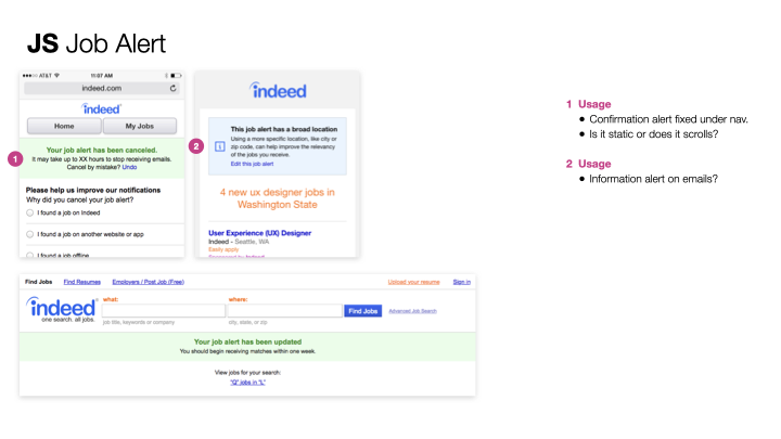
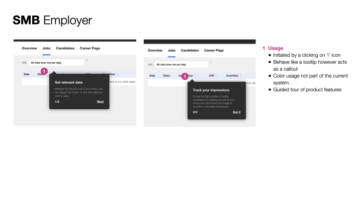
Designers must create their own solutions while waiting for design system to grow to meet their needs, and are frustrated by the lack of consistency and guidance they find when they search for answers, and end up making their best guess for their needs. This funneled into the collaboration work on Feedback system: Alerts which impacted business objectives [xx].
Problem
Within the latest version of the feedback component family, there was no clear usage of when to use which component. Designers were confused. Smattering of usage found across site, with indeterminate usage. Also not following industry standard.


Opportunity
How might we clarify how Indeed communicates information to users in relation to an action or status update, within a Feedback family?
Constraints
Within a 2 week sprint, my design partner and I started from a place of
information overload. 6 audits, over 500 pages.
context switching. several hands from our fellow designers.
Mining through the dense info to pick most relevant insights required us to dig into the work for those pieces of gold, make quick analysis, and start exploring solutions.
Which had the truths?
Approach
Research
Together with Elaiza I led an audit & analysis of internal and industry examples.
We observed a smattering of usage found across site, with indeterminate usage. Also not following industry standard.


Clarify and define (and redefine)
This was the most challenging and critical step.
Filtering the noise. Start drawing delineation between components and patterns.
Before placing a pixel in Sketch, we asked ourselves,
“Are we clear about the purpose or definition of “feedback family”?
”Are we clear on the difference between Alert, Toast, Banner, Callout, Tooltip, and when I would use each?”
No. We needed to dig further.
We did this through respectfully challenging team leads’ assumptions to clarify, then clarify some more.
Where were there redundancies?
Without this clarity and direction setting, we would not be able to explore solutions as quickly, and in turn bring clarity for Design System users.
What we call the “things” matter also. Banner and Toast have baggage. In the spirit of clarity I also pushed for calling the components what they are.


Whiteboard sessions to clarify and align on feedback family component parameters.
What the set and its individual components are and aren’t.

The definition process can feel a lot like Inception!
Stepping back to identify what feedback components communicated in a job seeker or employer journey gave us an “aha” moment for Toasts. Toasts are more confirmation, while “success” messaging belongs to a broader pattern level, not within the component level.
Explore solutions
Alert component
“Atomics” approach
Approach accessibility with “shift left” mindset–early in design

Outcome & Next steps

Brainstorm for Q4-Q1 roadmap
Met positive feedback with internal group so far. Exceeded Design System leader’s expectations for “cracking the code” to a core component family.
Do early testing with product teams. Validate design through research / testing with product groups, and iterate on findings.
Observations being on a Design System team
In an era when design systems are new for many companies, some common perceptions I’ve heard from those outside and within the team include
“Design System team’s job is to ‘spec out’ other (product) team’s work.”
“Why don’t we take what other companies have already done, and reskin with our own brand?”
“Let’s crank these components crank out.”
Those may be some way to go about it, but they fall short of thinking holistically–which should be fundamental to any design system team objective.
Yes, understanding and documenting specifications make up a portion of our work–downstream.
Yes, we should look at what other companies have done–to learn.
We still need to apply critical thinking if and how good examples seen elsewhere can inspire the work, as we would any sort of competitive analysis.
Our design team’s mission in building the system starts with how we approach any design problem–understanding and empathizing with our users’ needs.

